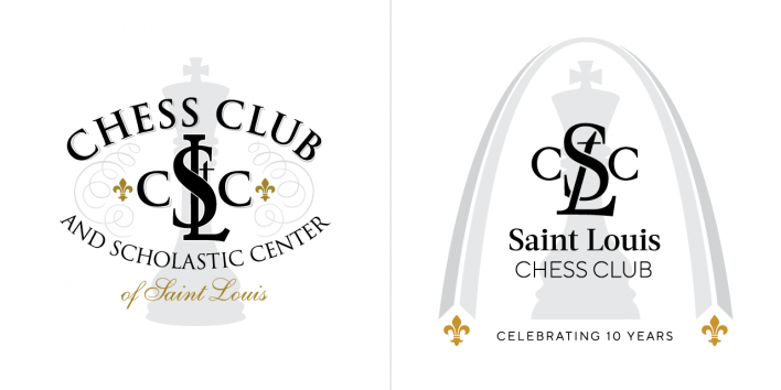
The Chess Club and Scholastic Center of Saint Louis is excited to announce its commemorative rebrand, coinciding with its tenth anniversary. For the past decade, the CCSCSL has built its reputation as the premier destination for chess from its Midwestern home. Throughout 2018, the Chess Club will celebrate its tenth year with commemorative tournament graphics, a robust programming calendar, and a brand new name — Saint Louis Chess Club. Paige Pedersen, lead designer for the Saint Louis Chess Campus, breaks down the concepts and methodology behind the rebrand:
A Distinctly Saint Louis Mark
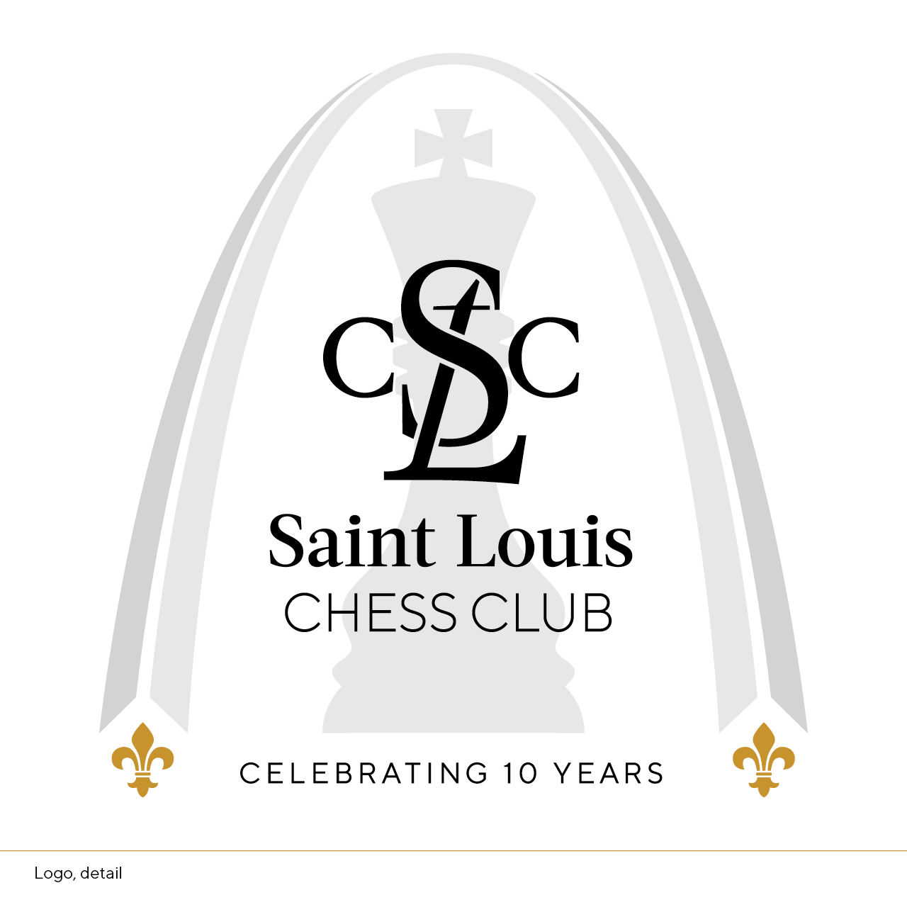
Saint Louis pride is at the heart of every Chess Club endeavor, and what represents Saint Louis like the Gateway Arch? The “Gateway to the West is the Gateway to Chess” said a headline in 2016, and it’s never been more true. The Club’s new brand identity celebrates the city’s heritage with Saarinen’s modernist arch perched atop golden fleur de lis [a symbol of Saint Louis, and existing brand imagery for the Club], and highlights chess as a landmark of the United States' Chess Capital.
The resurgence of chess in the United States, largely due to the efforts of the Saint Louis Chess Club, has encouraged chess organizations, publications, and brands to flourish across America. The STLCC needed to strengthen its brand recognition and refresh its image as a pioneer of chess in the digital age by streamlining the organization’s name. Colloquially known as the “Saint Louis Chess Club,” we've shortened the name. The simpler, straightforward moniker clarifies the brand and focuses its emphasis on the Saint Louis community.
Monogram
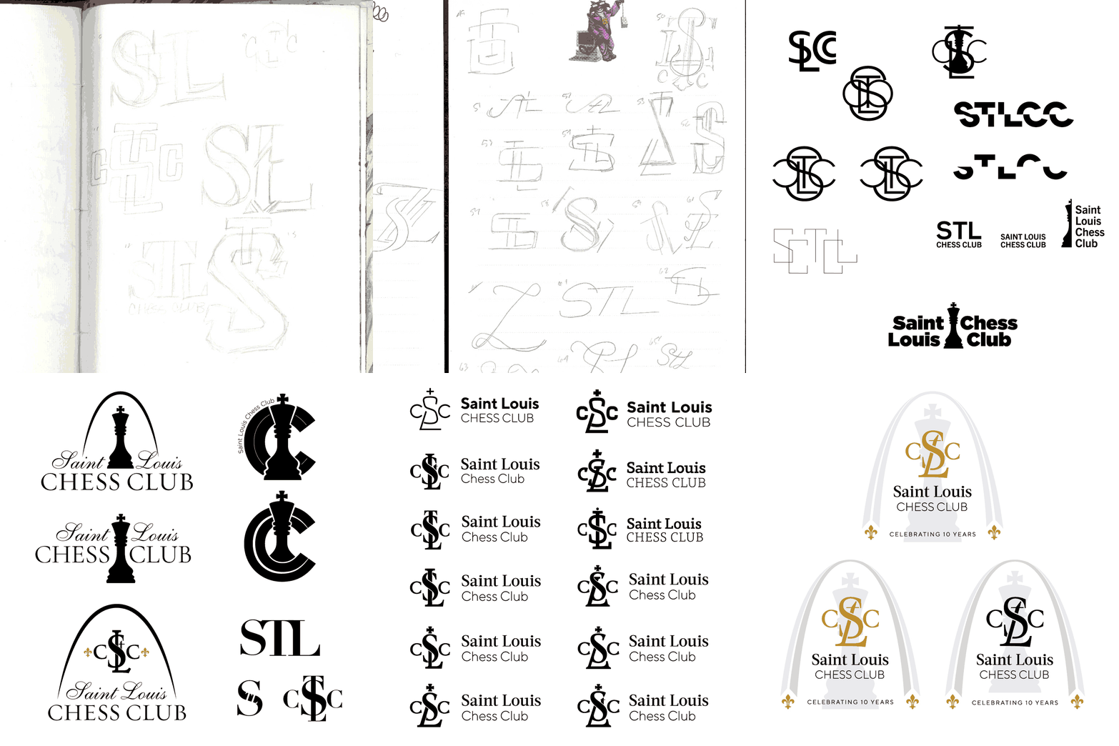
Reworking the logo mark began on paper, starting with the centerpiece of the existing logo — the emblem. The Chess Club’s acronym was drawn over and over again, rearranging the letters into different shapes and combinations. About 100+ thumbnail sketches later, these drafts moved from paper to screen and continued to refine the mark by simplifying the forms for a refreshed silhouette.
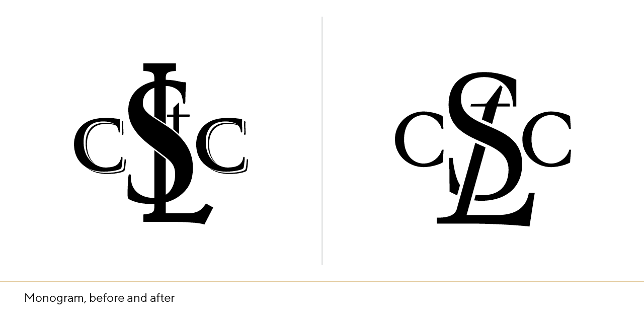
The widened base of the slanted L, combined with the t on top, mimics the form of the King piece with its signature cross-shaped finial — the flanking C’s remain, losing their engraved look and now enjoy a modern symmetrical curve and elegantly angled serifs.
Typography
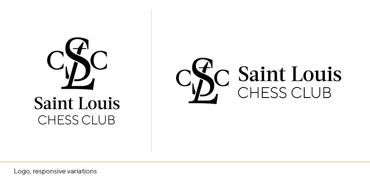
While finalizing the form of the new emblem, the need for versatility came to the forefront — business cards, letterhead, brochures, internet-based media, broadcast graphics, even embroidery and merchandise design — the new logo needed to to be responsive to its environment. Simplified variations on the primary logo design, paired with a duo of versatile, workhorse typefaces, the letterforms receive a tailored, modern update.
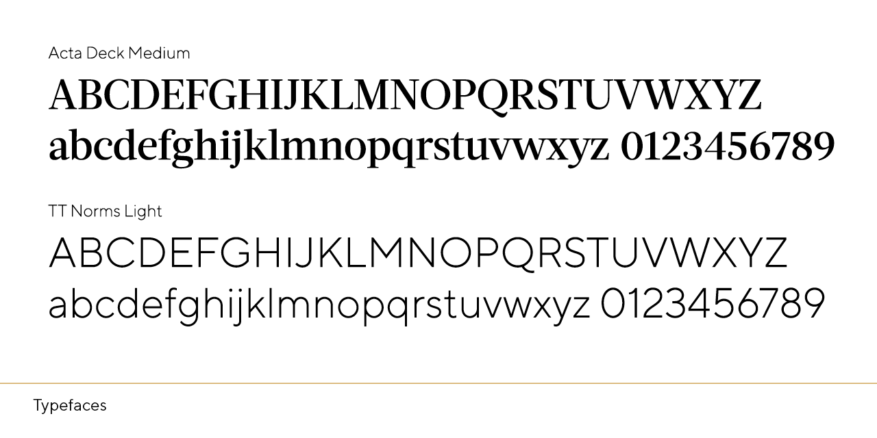
Typefaces Acta and TT Norms [aptly named for use by a chess organization] replace Trajan and Gotham. A wide range of weights, characters, and multilingual support in each, the clean, fresh newspaper serif and modern geometric Grotesk cater to both the classical elegance of the game, as well as the geometric minimalism and symmetry of the chessboard.
Color
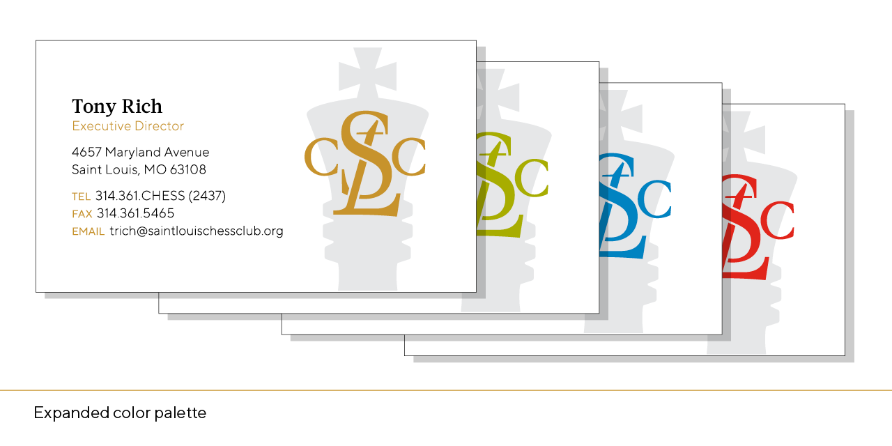
While black and white have long been ubiquitous on the chessboard, the symbolic grid began in India as a field of red and green long before its European transition to black and white. Returning to chess’ vibrant roots, the modular color system unites the STLCC’s branded initiatives while celebrating the diverse history of the game and the breadth of programming across the campus. The existing colors — black, white, and gold — are expanded to integrate the brand refresh of the World Chess Hall of Fame [the arts branch of the Saint Louis Chess Campus] which shares several key staff members and coordinates its exhibitions with the Club’s tournament schedule.
Building Champions: In the Classroom & the Community
Today, anyone with an internet connection can watch world-class chess matches and listen to expert commentators break down the tension of the game [for a layperson like me, this is essential] on one of the Chess Club’s online streaming platforms. These broadcasts reach hundreds of millions of viewers during national or international tournaments, and the branding of the Club needed to reflect their imprint on the global chess scene.
Not only does the Saint Louis Chess Club host and broadcast the world’s highest-rated tournaments and matches — it’s a place where people of all ages, backgrounds, and skill levels are welcome to sit down and play. Offerings include a wide variety of classes, free events that bring chess outdoors, outreach that teaches critical thinking skills and confidence, and an overarching mission to elevate the citizens and neighborhoods throughout the city. These programs are central to the Chess Club’s mission and underline their investment in promoting the game both on a local and international level.
Just as a Grandmaster considers his strategy many moves ahead, the Chess Club’s rebrand looks to the future of the organization [as well as representations of chess] and its presence worldwide. The visual lexicon of this ancient game is given new life as the Saint Louis Chess Club continues to innovate and pioneer American Chess in the 21st century.
About the Designer
Paige Pedersen has been designing for the Saint Louis Chess Campus since 2011; after earning her Bachelor’s degree in Studio Art [with focuses in graphic design and painting] from Saint Louis University. As the lead designer for the Chess Campus, Paige dedicates her days to making chess look cool in print and on the web across all branding initiatives for the Campus.


